Data visualization is a useful way for people, especially people who work with data, to show data in a way that makes it easy to understand. It turns files of numbers into beautiful graphs and charts that can be used to tell a story with data. This guide will teach you everything you need to know about data visualization.
First, let’s understand what Data Visualization is.
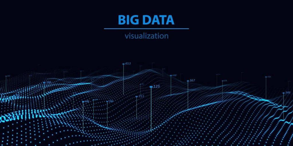
What is Data Visualization ?
Data visualization is the process of showing information and data using charts, graphs, maps, and other visual tools. With these pictures, it’s easy to see if a set of data has any patterns, trends, or strange things.
Visualizing data also makes it easier for people who aren’t skilled to understand the data. For instance, a government health service might give a map of places where people have been vaccinated.
Second, let’s understand the benefits of Data Visualization.
BENEFITS OF DATA VISUALIZATION
Data visualization can be used in many ways in almost every area, such as public policy, banking, marketing, retail, education, sports, history, and more. Here are some good things about showing data:
- Storytelling
Color and pattern have a strong pull in all kinds of fashion, art, and design. Colors and patterns help us understand data and figure out what it’s trying to tell us.
- Accessibility
Everyone can understand and use the information that is being spread.
- Visualize Relationships
When data is shown visually, like in a visualization or chart, it’s better to see patterns and links.
- Exploration
With more data available, researchers, teams, and decision-makers can do more.
Now we can study about tools of data Visualization data :
Tools of Visualization Data
When it comes to tools for presenting data, there are a lot of options to pick from. Before making a final choice, it’s important to think about the benefits and drawbacks of using an open-source tool instead of something like Excel or Google Data. Here are some tools that are commonly used to show how data looks.
- Tableau
- Google Charts
- Dundas BI
- Power BI
- JupyteR
- Infogram
- ChartBlocks
- D3.js
- FusionCharts
- Grafana
Third, let’s understand about types of data Visualization.
Types of data Visualization:-
Visualizing data is as easy as making a bar graph or scatter plot, but it becomes very useful when you compare, say, the median age of the US Congress to the median age of Americans. Here are a few of the most common ways to show data:
- Table : You can make a table to show data in rows and columns quickly and easily in Microsoft Word or Excel.
- Chart and graph: Data is shown along an x and y plane as bars, points, or lines to make it easier to compare various types of information. A data visualization is a graphic that shows facts and also has text.
- Gantt chart : A Gantt chart is a type of bar chart that is used in project management to show how time is proceeding and how every assignment is progressing.
- Pie chart : A pie chart shows statistics as percentages shown by “slices” of a pie, with the whole thing equaling 100%.
- Geospatial Visualization: Choropleths and heat maps are two types of data visualizations that use shapes and colors to show how geographical places are related.
- Dashboard: Analysts can both understand and show data better with the help of data visualizations and data displays, which are usually used in business.
DATA VISUALIZATION EXAMPLES :-
Users of data visualization tools can quickly make charts and graphs to show their data. Here are a few ways that data visualization is used in the real world:
- Data science: Libraries written in languages or tools like Python or R give data scientists and researchers the tools they need to look at data and figure out what it all means. These data specialists save time and work by coding their study with colors, charts, lines, and shapes.
- Marketing : Tracking data like web traffic and social media analytics can help marketers figure out how customers find their goods and whether they are early adopters or more like “laggard buyers.” Marketers and other stakeholders can use charts and graphs to better understand these trends.
- Finance: Investors and financial advisors look at the price trends of stocks, bonds, dividends, and other commodities in the past to figure out if they are good investments in the short and long run. On line graphs, analysts can switch between months, years, and decades to see trends more clearly.
- Health policy: Choropleth maps, which color data based on where it is (countries, states, continents), can be useful tools for people who make decisions. You can use these maps to find out how common diseases like cancer and Ebola are in different parts of the world.
Now we can discuss about which job that use data Visualization-
In many areas, from marketing to data analytics, people want to know how to visualize data well. People in the following jobs can gain from learning how to visualize data:
- Data visualization analyst : As a data visualization analyst (or professional), it would be your job to take large sets of data and use them to make maps, charts, and infographics, and then improve them.
- Data visualization engineer: Developers and engineers who specialize in data visualization know how to use SQL and are good at helping product teams make screens that are easy for end users to use and give them useful information
- Data analyst: The job of a data analyst is to collect, clean, and examine sets of data so that they can be used to answer questions or solve business problems.
These days, you can find information just about anywhere. Skills in data visualization are useful in many creative areas, such as graphic design, content strategy, and social media. As an email marketer, you could make dashboards to keep track of metrics, and as a communications artist, you could make infographics with useful information.
Conclusion
In the end, a good data visualization should use images to make a set of data clear and easy to understand. The best ways to show data make it easy to understand at a look. Data visualization allows us to instantly absorb and act on insights from complex data. By leveraging visual best practices and tools that amplify cognition and understanding, we can make better decisions and solve problems faster. Unleash the power in your data through effective visualization. Turn raw statistics into compelling stories that drive impact.