Find out how to choose the best chart type for your data. This detailed guide tells you everything you need to know to make your data display stand out.
In the data-driven world of today, it’s important to be able to show information visually. Whether you’re a business analyst, a researcher, or a student working on a project, picking the right chart type can make a huge difference in how your data is understood and appreciated. In this guide, we’ll show you how to choose the best chart type for your data. This will make sure that your images not only get your message across but also keep your audience’s attention. Let’s get started!
Data visualization is a strong tool that can turn complicated data into insights that are easy to understand. To use this power, though, you must first pick the right chart type for your data and goals. This guide will teach you what you need to know and how to do it. We’ll talk about the different kinds of charts, how they can be used, and how to make charts that are both visually appealing and useful.
How to Pick the Best Chart Type for Your Data
Choosing the right chart type is a very important part of data presentation. It can change how your audience understands the data, affect what choices they make, and help them understand it better. Let’s look at the steps you can take to make sure you choose the right thing.
Look at your data
Before you can pick a chart type, you need to know your data inside and out. Think about:
What kind of information do you have? Is it based on numbers, words, or time?
Do you need to compare one set of data to another or more than one?
How big is your set of data?
By answering these questions, you’ll get a better idea of how your data works and be able to cut down your choices.
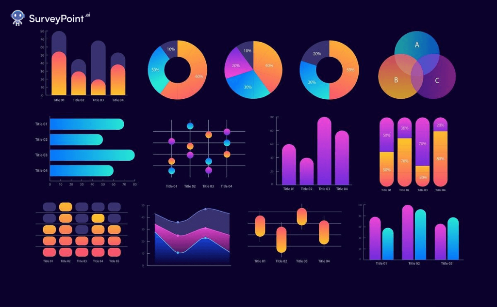
Top 11 Chart Type for Your Data Visualition
A chart in data visualization is like a picture that helps us understand information better. It shows numbers and data in a simple and visual way, like a graph or a picture. This makes it easier for us to see patterns, compare things, and make decisions based on the data. So, a chart is like a helpful tool that turns boring numbers into a picture that tells a story about the data.
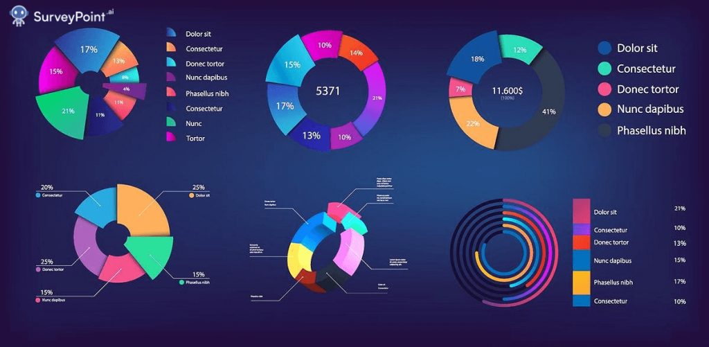
Pie Chart: A pie chart is like a pizza sliced into pieces. It shows how different parts (or slices) contribute to a whole. The bigger the slice, the more it represents in the whole.
Bar Chart: Imagine a collection of vertical bars of different heights. Each bar represents something, like the height of a plant. The taller the bar, the bigger the value it represents.
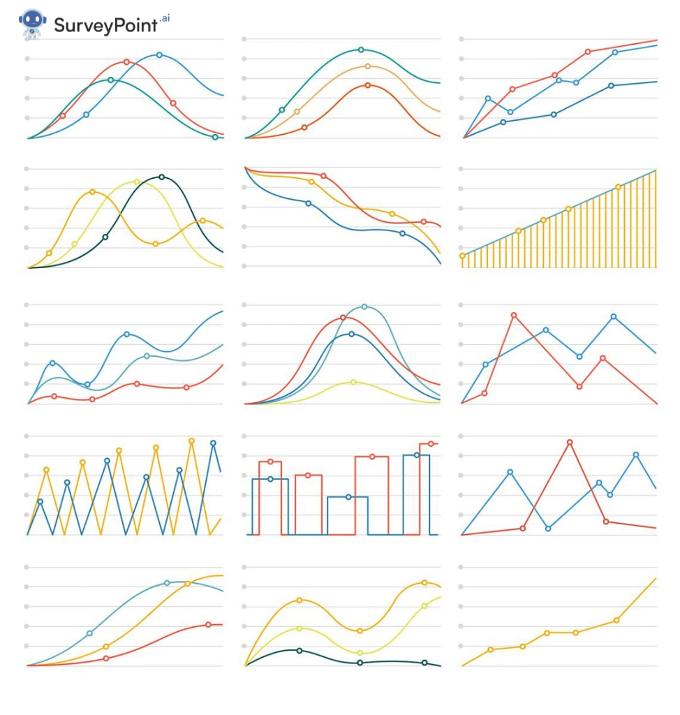
Line Chart: Think of a line chart as a connect-the-dots game. It connects points with lines to show trends or changes over time, like how your height changes as you grow.
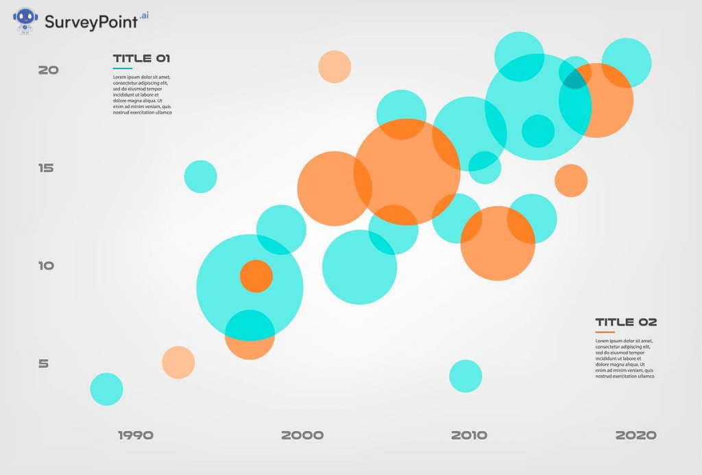
Bubble Chart: Picture bubbles of different sizes on a graph. These bubbles represent data points with two values: one on the horizontal axis, one on the vertical. The bigger the bubble, the larger the data values.
Gantt Chart: Gantt charts look like horizontal timelines with bars. They help plan and visualize tasks over time, showing when each task starts and ends, like a project schedule.
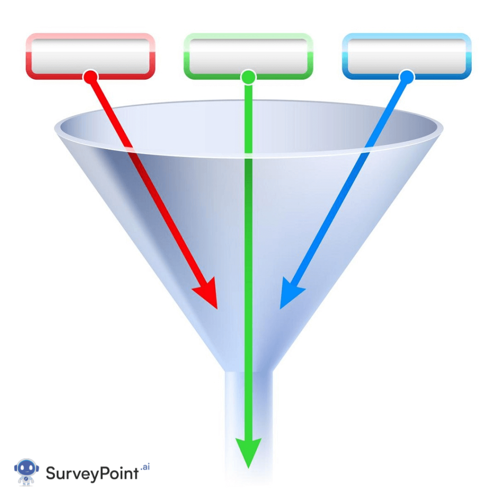
Funnel Chart: Imagine a funnel that starts wide and narrows down. It represents a process where many things go in at the top, but only a few come out at the bottom, like sales leads becoming actual customers.
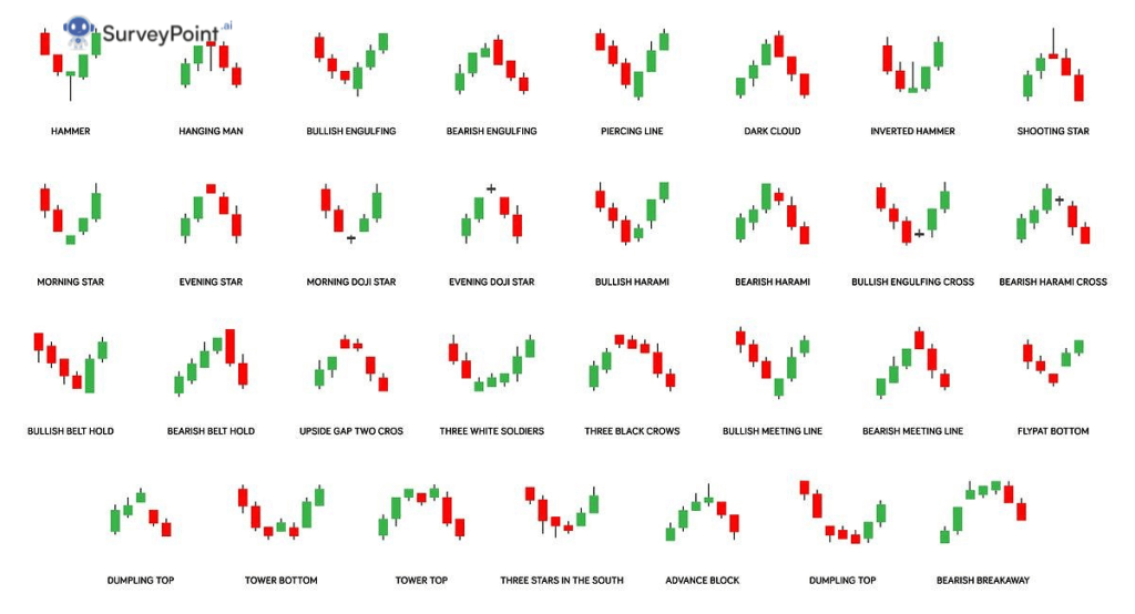
Candlestick Chart: This chart looks like candles with different heights and shapes. It’s often used in finance to show how the price of a stock or asset changes over time.
Stacked Area Chart: Picture multiple areas stacked on top of each other, like layers of a cake. Each layer represents a category, and the chart shows how they all add up over time.
Matrix Chart: Think of a grid with rows and columns, like a spreadsheet. It helps organize and compare data in a structured way, making it easier to see patterns.
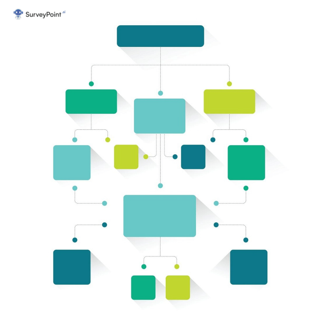
Flowchart: A flowchart is like a map for processes. It uses shapes and arrows to show the steps in a sequence, helping to understand how things work or should be done.
Spider Chart: Imagine lines radiating from a central point, like a spider’s legs. Each line represents a different category or attribute, and where they connect shows how something compares across those categories, like a radar chart for evaluations.
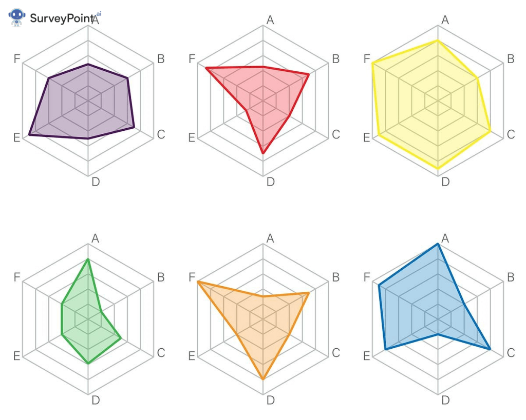
Figure out what you want
Every map is used for a certain thing. Do you want to show changes over time, compare groups, or emphasize ratios? The goal of your chart should match your facts and the message you want to get across.
Pick the Right Graph
Now that you know what your data is and what you want to do with it, you can choose the right chart type:
Bar charts are a flexible and useful way to compare groups or show how data changes over time.
Line graphs
Line charts are great for showing ongoing data because they can show trends and changes over time.
Pie graphs
Pie charts are the best way to show how parts of a whole fit together and how big or small they are.
Spread Plots
Scatter plots are a great way to show how two factors are related to each other. They also help find correlations.
What are histograms?
Histograms are your best bet if you need to see how data is spread out and find trends.
Location maps
Area charts can be used to show trends, just like line charts, but they focus on the total area under the curve.
Plots in boxes
Box plots are the best way to show how data is spread out, including outliers and quartiles.
Heatmaps are very useful when you need to show data in a grid style and draw attention to differences.
Change your chart
Once you’ve chosen the right type of chart, you can change it to make your data stand out. Pay attention to things like signs, axes, and colors. Make sure your chart looks good and is easy to understand.
Check and improve
Don’t give up after your first try. Test your chart with people who might look at it, get their comments, and change it based on what you hear. The goal is to make a chart that clearly and effectively gets your point across.
You Must Like

Top 10 Techniques for statistical tests that give accurate results

Unlock the Power of Research Design: Your 5-Step Path to Success

How to Unleash the Phenomenal Power of Data Visualization: 7 Steps to Success

Data Visualization: Meaning, Tools and Techniques
FAQs
Q. Can I use more than one type of chart in a single visualization?
- Yes, you can use different chart types together to show different parts of your data. These are called “combination charts.” For example, you can combine a bar chart and a line chart into one image.
Q: I want to make a chart. Are there any free tools that can help me?
- Yes, for sure. There are a lot of easy-to-use online charting tools, like Tableau, Excel, and Google Charts, that make it easier to make charts.
Q: How are a histogram and a bar chart different?
- Histograms and bar charts both use graphs to show data, but histograms are used to show how a single variable is distributed, while bar charts compare more than two groups.
Q. Can I use 3D charts to show how data looks?
- Even though 3D charts may be pretty to look at, they often distort data and make it harder to understand. Most of the time, 2D charts are better because they are more accurate.
Q. How do I decide which colors to use on my charts?
- Think about using colors that are easy to tell apart and have a sensible order. Don’t use too many colors, because that can make people confused.
Q: Is it important for my charts to have a title and labels?
- Titles and labels are very important. They set the scene and help people understand what the chart is showing.
In the end,
Choosing the right type of chart for your data is a skill that can help you share information much more effectively. By looking at your data, figuring out what you want to show, and choosing the right type of chart, you can make visuals that speak to your audience and make your data-driven ideas really stand out.
Remember that the key to good data visualization isn’t just picking the right chart; it’s also customizing, trying, and improving. So go ahead and try out different types of charts and see how your data come to life.
