![25 Different Types of Charts and Graphs for Data Visualisation [With Example]](https://surveypoint.ai/knowledge-center/wp-content/uploads/2023/10/Untitled-design-4-2-2-1-1024x735.webp)
In this blog, we’ll explore 25 different types of charts and graphs commonly used for data visualization, each with its unique characteristics and best use cases. With real-world examples, we’ll illustrate how these visual aids can help you present, understand, and extract meaningful information from your data. Whether you’re a data analyst, business professional, or simply curious about data visualization, this guide will expand your knowledge and enrich your data-driven decision-making process.
Data visualization is a powerful tool in the world of data analysis and interpretation. It transforms complex information into clear, understandable insights. One of the key ways this is achieved is through the use of various types of charts and graphs. These visual representations not only make data more accessible but also enhance our ability to spot trends, patterns, and anomalies.
5 Different Types of Charts and Graphs for Data Visualisation
Bar Graph
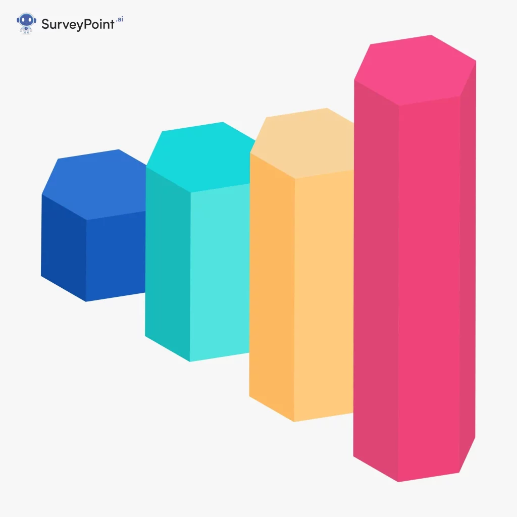
Description: A bar graph uses rectangular bars to represent data, with the length or height of each bar corresponding to the value it represents.
Use Cases:
Comparing data across different categories or items.
Showing the distribution of data or the frequency of occurrences.
Examples:
Sales by Product: Comparing the sales of different products in a store over a month.
Population by City: Displaying the population of various cities in a country.
Student Grades: Visualizing the grades of students in a class.
Budget Allocation: Showing how a household budget is distributed among different expenses.
Market Share: Analyzing the market share of competing companies in an industry.
Line Graph:
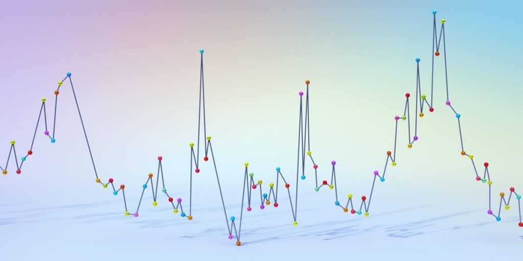
Description: A line graph uses lines to connect data points, making it ideal for visualizing trends and changes over time.
Use Cases:
Tracking changes in data over time.
Comparing multiple data series with a common time or x-axis.
Examples:
Stock Price Trends: Displaying the historical price of a stock over a year.
Temperature Variations: Monitoring temperature changes over the seasons.
Website Traffic: Analyzing website traffic patterns over a month.
Population Growth: Visualizing the population growth of a city over several decades.
Sales Trends: Studying the sales performance of a product over a year.
Pictograph:

Description: A pictograph is a graph that uses pictures or symbols to represent data, with the number of pictures indicating the quantity.
Use Cases:
Making data more engaging and accessible, especially for children or those with limited numerical literacy.
Visualizing data involving discrete, countable items.
Examples:
Fruit Consumption: Representing the number of apples, oranges, and bananas children eat using fruit icons.
Book Reading Challenge: Showing the number of books read by students with book icons.
Zoo Animals: Visualizing the types and counts of animals at a zoo with animal icons.
Survey Responses: Displaying responses to a survey with emoticon symbols.
Product Sales: Representing the number of units sold for various products using product icons.
Undirected Graph:
Description: An undirected graph is a mathematical structure consisting of nodes (vertices) connected by edges (links) where the connections have no direction.
Use Cases:
Modeling relationships between entities without a specific direction.
Analyzing network connections and dependencies.
Examples:
Social Network: Modeling connections between friends on a social media platform.
Transportation Network: Representing road connections between cities.
Collaboration Network: Showing co-authorship relationships among researchers.
Friendship Network: Visualizing the connections between individuals in a community.
Web Link Structure: Analyzing hyperlinks between web pages on the internet.
Frequency Distribution Graph:
Description: A frequency distribution graph displays the distribution of data values in a dataset, often using histograms or bar charts.
Use Cases:
Analyzing the spread and frequency of data values.
Identifying patterns, clusters, or outliers in data.
Examples:
Test Scores Histogram: Visualizing the distribution of test scores in a class.
Income Range Bar Chart: Displaying income levels in different income ranges.
Temperature Frequency Distribution: Analyzing the frequency of temperature values in a region.
Product Price Histogram: Showing the distribution of product prices in a store.
Time Spent on a Website: Visualizing the distribution of time spent by users on a website.
20 Different Types of Charts and Graphs for Data Visualisation
Bar Chart:
Description: A bar chart uses rectangular bars to represent data. The length or height of each bar corresponds to the value it represents.
Use Case: Bar charts are commonly used to compare and display data for different categories or items, such as comparing sales figures for different months or showing the population of various cities.
Examples:
Sales by Month: Comparing monthly sales figures for a retail store.
Population by Country: Showing the population of different countries.
Product Sales by Category: Comparing sales of various product categories.
Student Grades: Displaying the grades of students in a class.
Market Share: Visualizing the market share of competing companies in an industry.
Line Chart:
Description: A line chart uses lines to connect data points, making it easy to visualize trends and changes over time.
Use Case: Line charts are ideal for displaying stock price trends, temperature variations over the seasons, or any data that evolves with time.
Examples:
Stock Price Trends: Displaying the historical price of a stock over time.
Temperature Variations: Showing temperature changes over the course of a year.
Website Traffic: Monitoring website traffic over a month.
Population Growth: Visualizing the population growth of a city over decades.
Sales Trends: Analyzing the sales performance of a product over a year.
Pie Chart:
Description: A pie chart divides a circle into sectors, with each sector representing a proportion of the whole.
Use Case: Pie charts are excellent for showing the composition of a whole, such as the distribution of expenses in a budget or the market share of various companies in an industry.
Examples:
Budget Allocation: Displaying how a household budget is distributed among expenses.
Market Share: Showing the distribution of market share among competing companies.
Energy Sources: Visualizing the sources of energy in a country.
Demographic Composition: Displaying the age distribution of a population.
Task Time Allocation: Showing the time allocation for various tasks in a project.
Scatter Plot:
Description: Scatter plots use individual data points to show the relationship between two variables. Each point represents a data pair.
Use Case: Scatter plots are commonly used in scientific research to analyze the correlation between variables, like studying the relationship between height and weight in a population.
Examples:
Height vs. Weight: Analyzing the relationship between a person’s height and weight.
Exam Scores: Comparing the scores of students in two different subjects.
Correlation Analysis: Investigating the relationship between advertising spending and sales.
Stock Price vs. Volume: Studying the relationship between a stock’s price and trading volume.
Age vs. Income: Exploring the correlation between age and income for a population.
Area Chart:
Description: Similar to a line chart, but with the area under the line filled in. It’s often used for cumulative data display.
Use Case: Area charts are suitable for illustrating cumulative quantities, such as the accumulation of website traffic over time or the growth of a company’s revenue.
Examples:
Website Traffic: Showing cumulative website traffic over a year.
Revenue Growth: Visualizing the cumulative revenue growth of a business.
Population Pyramid: Displaying the cumulative population distribution by age.
Inventory Levels: Monitoring the cumulative inventory levels of a product.
Economic Growth: Analyzing the cumulative GDP growth of a country.
Types of Charts and Graphs
Histogram:
Description: Histograms group data into intervals (bins) and display the frequency of values within each bin.
Use Case: Histograms are used in statistics to understand the distribution of data, like analyzing exam scores to see how many students scored within certain grade ranges.
Examples:
Exam Scores Distribution: Analyzing the distribution of exam scores in a class.
Income Distribution: Showing the income distribution in a region.
Temperature Range: Visualizing the distribution of daily temperatures in a month.
Product Price Range: Analyzing the price range of products in a store.
Customer Age Distribution: Displaying the age distribution of customers in a business.
Radar Chart:
Description: Radar charts have multiple axes radiating from a central point, making it useful for displaying multivariate data.
Use Case: Radar charts are often used to compare the performance of different entities across multiple categories, such as assessing the skills of employees in different areas.
Examples:
Skill Assessment: Evaluating the skills of job applicants in different areas.
Product Comparison: Comparing products based on multiple features.
Team Performance: Assessing the performance of team members in various tasks.
Health Assessment: Evaluating an individual’s health in different aspects.
Sports Performance: Analyzing the performance of athletes in various sports categories.
Polar Chart:
Description: Polar charts use polar coordinates to display data, which is particularly useful for circular data.
Use Case: Polar charts are suitable for visualizing data with cyclical patterns, like annual temperature variations in a region or seasonal sales trends.
Examples:
Annual Temperature Variations: Showing temperature variations over a year.
Wind Direction Analysis: Analyzing wind direction frequency over a day.
24-Hour Energy Consumption: Visualizing energy consumption by hour of the day.
Cyclic Behavior: Studying the cyclic behaviour of stock prices over time.
Seasonal Sales Trends: Analyzing sales trends for a product with seasonal variations.
Box Plot (Box and Whisker Plot):
Description: A box plot shows the data distribution by displaying the median, quartiles, and potential outliers.
Use Case: Box plots are commonly used in statistics to identify data outliers and understand the spread of data, such as analyzing salary distributions in a company.
Examples:
Salary Distribution: Analyzing the distribution of employee salaries in a company.
Exam Score Comparison: Comparing the performance of students in different subjects.
Project Duration Estimation: Estimating the duration of project tasks.
Product Quality Assessment: Assessing the quality of products from different suppliers.
Temperature Range by Season: Showing the temperature range in a region for each season.
Gantt Chart:
Description: Gantt charts are bar charts used in project management to visualize project schedules and task dependencies.
Use Case: Gantt charts help project managers plan and monitor project activities, showing when tasks should start and end, making them ideal for project timelines and resource allocation.
Examples:
Project Timeline: Creating a timeline for the construction of a building, displaying task dependencies.
Event Planning: Managing the timeline for organizing a large conference.
Software Development: Tracking the progress of software development tasks.
Product Launch: Planning and monitoring the timeline for launching a new product.
Marketing Campaign: Organizing and scheduling the tasks for a marketing campaign.
Heatmap:
Description: Heatmaps use colours to represent data values within a matrix or grid.
Use Case: Heatmaps are used in various fields, such as genetics to show gene expression patterns, in finance to visualize stock price correlations, and in web analytics to display user behavior on a website.
Examples:
Website User Behavior: Showing the heat of user clicks on a webpage.
Genomic Data: Analyzing gene expression patterns in a heatmap.
Stock Correlation: Visualizing the correlation matrix of stock price returns.
Customer Satisfaction Survey: Displaying satisfaction levels by product and region.
Employee Performance: Assessing the performance of employees based on various criteria.
Waterfall Chart:
Description: Waterfall charts show how an initial value changes due to a series of intermediate positive and negative values.
Use Case: Waterfall charts are helpful in financial analysis to break down financial statements, budgeting, or understanding the impact of various factors on a company’s revenue or expenses.
Examples:
Profit and Loss Statement: Displaying the components that contribute to a company’s overall profit or loss.
Budget Variance Analysis: Analyzing the variations between budgeted and actual expenses in a project.
Cash Flow Analysis: Showing the changes in cash flow for a business over a specific period.
Stock Price Impact: Visualizing the factors influencing changes in a stock’s price.
Product Cost Breakdown: Exploring the breakdown of costs in the production of a product.
Sankey Diagram:
Description: Sankey diagrams illustrate the flow of resources or information between entities with varying widths of connecting lines.
Use Case: Sankey diagrams are often used in energy and environmental studies to show the flow of energy sources in a system or in marketing to visualize the customer journey on a website.
Examples:
Energy Flow: Visualizing the flow of energy from sources to consumption in a region.
Website User Flow: Displaying the flow of user interactions on a website.
Material Flow Analysis: Analyzing the movement of materials in a supply chain.
Water Usage Analysis: Showing the distribution of water use in a city.
Customer Conversion Path: Visualizing the steps in a customer’s journey from initial contact to purchase.
Spider Chart (Radial Chart):
Description: Spider charts are used to display multivariate data in a two-dimensional, spider-web-like format.
Use Case: Spider charts are frequently used in performance assessments to evaluate the strengths and weaknesses of individuals or entities across multiple criteria, like rating the skills of athletes or the performance of products.
Examples:
Employee Performance Evaluation: Assessing employee skills in various job-related areas.
Product Feature Comparison: Comparing products based on multiple features or attributes.
Competitor Analysis: Evaluating the strengths and weaknesses of competitors in different categories.
Athlete Skills Assessment: Rating athletes’ skills in various sports categories.
Project Risk Assessment: Analyzing project risks in different areas and their impact.
Candlestick Chart:
Description: Candlestick charts are used in financial analysis to represent the price movement of an asset over a specific time period.
Use Case: Candlestick charts help traders and investors understand the historical price behavior of financial assets, enabling them to make informed decisions in the stock market or cryptocurrency trading.
Examples:
Stock Price Analysis: Visualizing daily price movements of a stock.
Cryptocurrency Trading: Tracking price changes in cryptocurrencies like Bitcoin.
Forex Market Analysis: Analyzing currency exchange rate movements.
Commodity Price Trends: Monitoring price fluctuations in commodities like oil or gold.
Options Trading Analysis: Evaluating option price movements in financial markets.
Tree Diagram (Tree Chart):
Description: Tree diagrams are used to represent hierarchical structures, such as organizational charts or decision trees.
Use Case: Tree diagrams are commonly used to visualize organizational structures, family trees, or decision-making processes in business and operations research.
Examples:
Organizational Structure: Displaying the hierarchy of positions in a company.
Family Tree: Visualizing the relationships and generations within a family.
Decision Tree Analysis: Mapping out the decision-making process for complex choices.
Project Work Breakdown Structure: Decomposing project tasks into smaller components.
Classification Model: Illustrating the structure of a decision tree in machine learning.
Bubble Chart:
Description: Bubble charts use circles (bubbles) to represent data, with the size of each bubble reflecting a variable.
Use Case: Bubble charts are often employed to compare data in three dimensions, like showing the relationship between income, age, and expenditure for different demographics.
Examples:
Demographic Data: Showing the population of cities with the size of bubbles representing population size.
Market Analysis: Comparing products based on price and customer ratings.
Economic Indicators: Visualizing countries with GDP as the bubble size and GDP per capita as the x-axis.
Project Portfolio Analysis: Analyzing projects with bubble size indicating project budget and x-axis showing expected return.
Healthcare Data: Mapping hospitals with bubble size representing the number of beds and x-axis indicating patient satisfaction.
Donut Chart:
Description: Donut charts are similar to pie charts but have a hole in the centre, allowing for additional information display.
Use Case: Donut charts are useful for displaying the composition of a whole while also conveying additional data, such as showing the market share of products within different regions.
Examples:
Website Traffic Sources: Showing the sources of website traffic in a doughnut chart.
Expense Breakdown: Displaying the components of monthly expenses with additional information in the center.
Market Share by Region: Comparing market share in different regions with additional data in the center.
Product Sales by Channel: Analyzing product sales through various sales channels.
Customer Satisfaction by Category: Visualizing customer satisfaction ratings with category breakdown in the center.
Streamgraph:
Description: Streamgraphs are area charts that visualize data changes over time, particularly suited for stacked data.
Use Case: Streamgraphs are great for showing changes in data categories over time, such as visualizing the evolution of website traffic sources or the flow of resources in a manufacturing process.
Examples:
Social Media Mentions: Tracking the mentions of different hashtags over time on social media.
Stock Price Trends: Visualizing the distribution of price movements for multiple stocks over time.
Climate Data: Showing temperature and precipitation changes over the years.
Web Analytics: Analyzing user engagement on a website by visualizing page views.
Music Streaming Trends: Displaying the popularity of different music genres over time.
Kiviat Diagram:
Description: Kiviat diagrams are used to visualize data on a set of axes in a radial layout.
Use Case: Kiviat diagrams are commonly used in performance assessments, such as evaluating the strengths and weaknesses of products or services across multiple criteria.
Examples:
Skill Assessment: Evaluating an individual’s skills in various job-related areas.
Product Feature Assessment: Comparing products based on features or attributes.
Project Evaluation: Assessing the progress of a project in different categories.
Supplier Performance: Rating the performance of suppliers in various criteria.
Environmental Impact Assessment: Evaluating the impact of a project on the environment in different aspects.
You Must Like

Chart Type Selection Made Easy: 8 Expert Tips for Data Presentation

Looker: A Game Changer in Data Analysis

Data Quality Enhancement: Improving the Overall Quality of Data 2023

Why Data Cleaning is the Key to Successful Optimization – 7 Tips
Conclusion
Data visualization is an essential tool in our data-driven world, and the array of charts and graphs available can help convey information in a compelling and understandable way. We’ve explored 25 different types of charts and graphs in this blog, each with its unique strengths and best-use cases. From the simplicity of bar charts to the complexity of Sankey diagrams, there’s a visualization method for every kind of data.
It’s important to choose the right types of charts and graphs for your specific dataset and the story you want to tell. Scatter plots are ideal for showing relationships between variables, while heatmaps are great for representing large datasets with varying values. Donut charts and pie charts help display proportions, while tree maps and sunburst charts offer hierarchical insights.
Remember that effective data visualization is not just about creating aesthetically pleasing graphics; it’s about facilitating understanding and decision-making. The choice types of charts and graphs should align with your objectives and your audience’s needs.
So, whether you’re presenting sales data, survey results, or market trends, these diverse types of charts and graphs are powerful tools to make your data speak and guide you towards more informed choices and actions.
