People who are not part of an organization’s analytics team may need help understanding datasets as if they were speaking a foreign language. In this case, it’s helpful to see how the data looks. Data visualization lets experts take complicated information and make it easier for regular people to understand.
Having access to relevant data is a powerful tool. So, companies can find patterns, look at data, make intelligent decisions, and set goals that can be reached. Even if a company has all the vital information in the world, it can still fail if its leaders don’t learn how to use it.
This post will talk about what data visualization is and the data visualization trends that make up the future of data visualization.
Data Visualization: Meaning
Data visualization includes graphs, charts, heat maps, diagrams, sparklines, and world maps. Understanding and analyzing data presented visually makes it easier to get valuable insights quickly. The right people can then use the results to quickly make better decisions.
Tools for bi-visualization include support for data streams, AI integration, embeddability, collaboration, dynamic exploration, and self-service options to make it easier to show data.
Benefits of Data Visualization
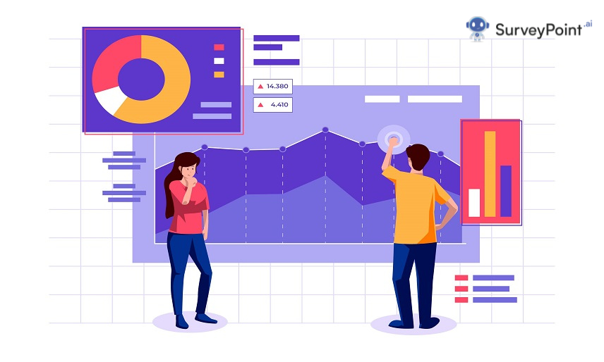
In many cases, a picture of the data can help people understand it and draw conclusions. Using data visualization tools to make data accessible to everyone in a business is an excellent way to do this. The result will be a more data-driven organization because workers will have the tools to make decisions based on facts rather than guesswork.
Data visualization is becoming increasingly important for getting information to people outside of an organization, like the news media, investors, regulatory agencies, and other stakeholders. Because data science is so essential in modern business, many companies now look for candidates who have worked with tools for data visualization.
Data Visualization Trends Over Time
Here are five emerging data visualization trends for 2023 that you should actively seek to incorporate into your work.
Putting Natural Language Querying into Business Intelligence Tools
NLQ uses machine learning and automation to make an interface that is easy to use and quick. It lets BI experts and business users type or speak their questions instead of writing them in code. It uses them as the starting point for reports that show data visually. One of the best things about NLQ is that anyone can use it, even if they haven’t used it before or need to learn more about it. With little room for error, it concludes that the data entered can be used to improve the company’s bottom line.
Create Text Automatically Using Natural Language Processes (NLG)
“Natural Language Generation” (NLG) is a shorthand way of saying that AI can write or speak stories based on facts given to it. NLG let’s data scientists and users share complex computer statistical data and get well-analyzed insights in plain English. Like natural language processing and natural language understanding, natural language generation is a lot about how people and machines talk to each other. A fast-growing trend in advanced data visualization is using five more phases of natural language generation (NLG).
- Finding Inputs
- Data analysis
- Putting together a plan for the document
- Create sensible sentences
- Verify proper grammar
Among other things, this technology is used to put NLG into automatic chatbots and virtual assistants, summarize news stories, and turn financial records into papers that are easy to read.
Graphics and Visuals for Statistics
More than simple bar charts, pie charts, and road maps are needed to convey your company’s message to customers. Newer ones have fixed the problems with older ways of visualizing data. They are more accurate depictions of their fields, give deeper insights, are more exciting and easy for people to use, and look better. Dashboard Worx provides you with what you need in today’s fast-paced, profit-driven market: a way to make unique data visualizations and important statistical graphics in a short amount of time with software that usually doesn’t let you do that.
Interactive Data Visualization on the Web
Data-driven documents, as D3.js is also called, give businesses a cutting-edge way to show data on the web. D3 is a JavaScript package that lets you make your own interactive data displays for the web. Some more examples of toolkits that can be used are Prefuse, Flare, and Protovis. D3 is the library for data visualization with the most users and documentation, while Protovis is used for static visualizations. D3 makes web-friendly designs that are both useful and nice to look at. It does this by using a variety of formats that work well for online visualizations, such as Arrays, Objects, CSV, JSON, XML, etc.
Real-Time Data Visualization
Cloud computing allows businesses to track and share data in real time across many locations. Any chart or graph can be updated in real-time, giving visualizations a new twist (in real-time). Now that we have more information, people can stop guessing and start finding solutions that are more likely to work. Companies can see how well they are doing before the week’s or month’s end.
Real-time data visualization will be made up of two main parts.
- Data Stream
- Visualizations of data that can be accessed through a user interface
With the help of data streams, it’s easier to track how data changes over time. The data is sent in a steady stream, and when the data changes, new packets are added. As each source’s API makes new numbers available, they can be used for everything from predicting the weather to updating stock prices and revenue.
User interface (UI): Real-time data visualization needs a UI that can respond to user input and show updated information in real time.
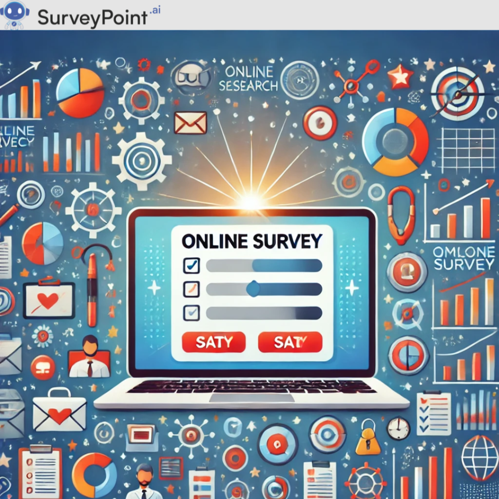
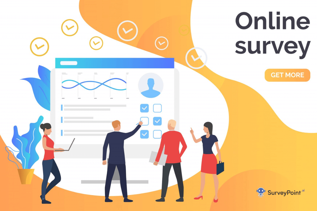
Survey Data
The use of survey results is becoming increasingly common. Ten years ago, it was much easier to collect information through in-person surveys, phone surveys, and questionnaires. Online surveys have now taken its place. Survey Point can help you create the most reliable surveys.
Conclusion
Our goal in writing this post was to glance at some of the most exciting developments in data visualization today. Your company might lose ground if you don’t use the most up-to-date ways to show data. It’s time to use the services offered by companies like Survey Point, which make it easier than ever to visualize data and customize it with just a click of a button on the software tools.