User Experience (UX) is the heart and soul of digital design. As the digital landscape continues to expand, creating products that delight users has become not just a goal but a necessity.
According to a recent survey by Adobe, 38% of people stop engaging with a website if the content or layout is unattractive. This statistic underscores the significance of understanding and improving UX.
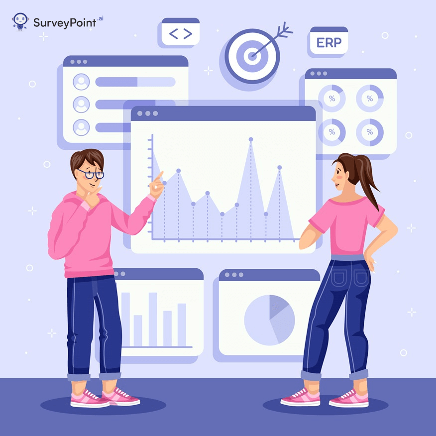
To see the effectiveness of the digital design and user interactions, key UX metrics play a crucial role. In this blog, we’ll discuss the essential UX metrics and KPIs.
UX Metric 1: User Engagement
User engagement is the metric that measures how much time users spend interacting with your website or application, the number of pages they visit, and the actions they take. One of the most common metrics to gauge engagement is “Time on Page.”
For instance, a news website might want users to spend more time reading articles. If the average time on a page is just a few seconds, it indicates that users might not be finding the content engaging enough.
UX Metric 2: Bounce Rate
You walk into a store, take one look, and walk right back out. That’s the online equivalent of a high bounce rate. Bounce rate measures the percentage of visitors who leave your site after viewing only one page. A high bounce rate might indicate that users didn’t find what they were looking for or that the page took too long to load.
For example, an e-commerce website with a high bounce rate on its product pages might have issues like slow loading times or unclear product information.
UX Metric 3: Conversion Rate
The conversion rate is like the scorecard of your design’s effectiveness. It measures the percentage of users who complete a desired action, like signing up for a newsletter, making a purchase, or filling out a contact form.
For example, an online store can measure its conversion rate by calculating how many visitors actually make a purchase. A low conversion rate might indicate issues with the checkout process, product presentation, or the trustworthiness of the website.
UX Metric 4: Usability Testing Metrics
Usability testing is like inviting friends over to try a new recipe – their feedback tells you if it’s easy to follow and tastes good. Usability testing metrics focus on how easily users can interact with your product. One important metric is the “Task Success Rate,” which measures the percentage of users who complete specific tasks successfully.
For instance, a mobile app might have a task where users need to find and add a product to their cart. If many users struggle with this task, it suggests design or navigation issues.
Metric 5: Customer Satisfaction (CSAT)
Customer satisfaction is like getting a thumbs-up after helping a friend. It measures how happy users are with your product or service. One way to measure CSAT is through a simple survey where users rate their satisfaction on a scale.
For example, after using an online booking platform, users might be asked to rate their experience. A low CSAT score indicates that users are not finding the experience enjoyable or helpful.
What’s the Reason for Measuring UX?
| Reasons to Measure UX | Examples from Different Industries |
| 1. Improved Satisfaction | In e-commerce, analyzing website navigation helps identify frustrating user journeys, leading to smoother online shopping experiences. |
| 2. Identify Pain Points | In healthcare apps, tracking user interactions can reveal confusing features, allowing for better patient engagement and smoother appointment scheduling. |
| 3. Enhanced Engagement | In gaming, studying user interactions with different game levels helps developers create more captivating challenges, keeping players engaged. |
| 4. Optimized Conversion | In finance, measuring clicks and form fills on a banking app can show where users drop off, leading to enhanced conversion rates for services. |
| 5. Effective Content | In media, tracking user interactions with news articles highlights preferences, leading to tailored content delivery and increased readership. |
| 6. Informed Design | In automotive UI, analyzing touch screen usage patterns guides the design of intuitive controls, resulting in safer and user-friendly driving experiences. |
| 7. Competitive Edge | In the hospitality industry, analyzing user feedback on booking platforms helps improve booking processes, giving a competitive advantage. |
User Experience (UX) Metrics and KPIs: Measuring Success in Everyday Things
To understand how well people like and use something, we use special tools called metrics and KPIs (Key Performance Indicators). These help us measure how good the experience is and make things better. Let’s look at how this works in different industries:
1. E-Commerce:
In online shopping, UX metrics could be how quickly a webpage loads or how easy it is to find products. A KPI might be the “conversion rate,” which shows the percentage of people who buy something after visiting the site. For example, if a website sells clothes and 5 out of 100 people buy something, the conversion rate is 5%.
2. Mobile Apps:
For mobile apps, UX metrics include things like how often people open the app and how long they use it. A KPI could be the “retention rate,” which tells us how many people keep using the app over time. Imagine a game app – if many players keep playing it for weeks, the retention rate is high.
3. Healthcare:
Even in healthcare, UX matters. Imagine a patient portal where people check their medical records. Metrics could be how fast patients find what they need, and a KPI might be “patient satisfaction.” If many patients say they’re happy with the portal, it’s a good sign.
4. Banking:
In the banking world, UX metrics could measure how easy it is for customers to navigate through online banking services. A KPI might be “task success rate,” showing how many people can complete tasks like transferring money without any problems.
5. Entertainment:
When it comes to streaming services, UX metrics might measure how fast videos start playing or how many times people rewind or pause. A KPI could be “engagement,” showing how often users interact with the content, like sharing shows with friends.
Key Differences: UX Metrics vs. KPIs
| Aspect | UX Metrics | KPIs |
| Definition | UX metrics measure specific aspects of user experience. | Key Performance Indicators (KPIs) are measures of business success. |
| Focus | They focus on user interactions, satisfaction, and usability. | They focus on overall business goals and performance. |
| Usage | Used to improve user experience and design. | Used to gauge business performance and strategy. |
| Beneficiaries | UX metrics benefit designers and developers aiming to enhance user experience. | KPIs benefit business owners and managers making strategic decisions. |
| Frequency | Measured frequently to track ongoing user experience improvements. | Monitored regularly, often on a monthly or quarterly basis. |
| Direct Impact | UX metrics influence design adjustments, impacting user satisfaction. | KPIs directly impact business decisions, driving growth and profitability. |
In the travel industry, let’s look at an example:
- UX Metric: “Booking Abandonment Rate” would tell how many people start booking flights but leave before finishing. This guides travel websites to simplify their booking process.
- KPI: “Revenue per Available Room (RevPAR)” measures hotel profitability. It directly influences pricing strategies and marketing campaigns.
In the entertainment industry:
- UX Metric: “Engagement Rate” in a video streaming app calculates how much time users spend watching videos. This informs content recommendations.
- KPI: “Average Revenue Per User (ARPU)” evaluates the financial performance of the app. It guides pricing models and content investment decisions.
Measuring User Experience: 9 Key UX KPIs to Keep Track Of
1. Conversion Rate: If a website gets many visitors but not many become customers, it’s a bad sign.
2. Bounce Rate: Think of a playground. If kids come but leave right away because it’s not fun, that’s a high bounce rate. For websites, if people come and leave quickly, it shows they didn’t find what they wanted.
3. Task Success Rate: For apps, it’s about how easily people can do tasks. If they can’t find the ‘play’ button in a game, it’s not a good task success rate.
4. Loading Time: Online, waiting for a page to load can be boring. Faster loading times mean people are happier using websites or apps.
5. Customer Satisfaction (CSAT): For online shopping, after buying, people rate their happiness. High ratings mean happy customers.
6. Net Promoter Score (NPS): If people like an app so much they tell friends, that’s a high NPS. It shows if people love it.
7. User Engagement: For social media, more likes, comments, and time spent mean people really like it.
8. Error Rate: In apps, errors annoy users. Counting errors helps make things smoother.
9. User Feedback: IFeedback helps her know what you like. For businesses, feedback helps improve websites and apps.
Wrapping Up
Metrics and KPIs fit together to give businesses a clear picture of how users are enjoying their products. This helps companies make their services stand out and be on the top of every consumer’s mind!
