
Your spreadsheets can sometimes leave you guessing. While most people rely on it, it’s true that numbers can get complicated. But what’s worse than those number-loaded Excel cells? We say bad data visualization.
Simply put, data visualizations are perhaps the best way to get the hang of numbers. They are easy to understand, catchy, and pretty convenient to represent.
But a lot can go wrong when you refuse to accept critical factors to make the right visual. Wait, how do I choose the right visual? Good data visualization examples are easy to understand, follow a distinct pattern, and are not misleading.
However, sometimes, people fail to follow the basics of making data visuals, creating something that is either misleading or impossible to comprehend.
Let’s look at the worst data visualization examples so you can get inspired and do it right in the future.
Data Visualization Examples That Don’t Work
Best Batting Talent Going Wrong
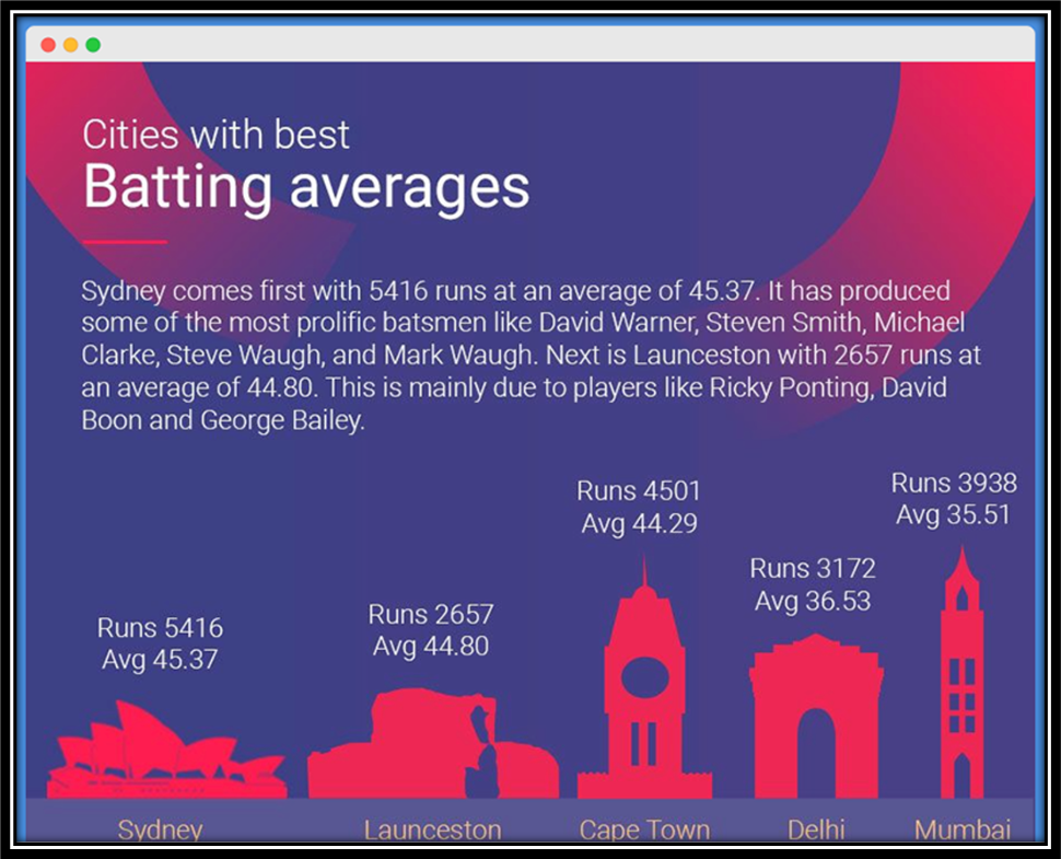
In 2019, ESPN CricInfo researched, predicting the Cricket World Cup winner. In the article, the data visualization represented different competitors with their best batting averages.
But when you look at the visual, it is pretty hard to comprehend what it is all about. You won’t understand unless you read the article, which denies the whole idea. Moreover, another thing that went wrong here is the color choice.
Technically, blue and red are the least friendly to eyes. Besides this, this visual is neither a bar nor a chart. While the bars were replaced with the country’s monuments, it doesn’t actually link the idea of cricket in the picture.
And, when you look at the graph, each bar’s height is different. For instance, while Delhi’s bar is taller than most, the numbers imply that the city is least predictable to win the match.
CHECK OUT: Data Visualization Trends 2023: What Are They?
An Unappetizing Avocado Toast
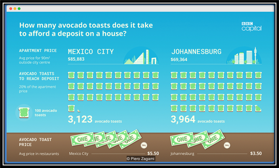
BBC’s avocado toast index is perhaps one of the best real-life examples of bad data. Let’s give you an insight first.
This visual is about how much avocado toast it would take to afford a house deposit. The cities studied were ten, including London, San Francisco, Mexico City, and Tokyo.
A single graphic is used to depict two different cities. But, when you look at it, it’s pretty hard to understand what each illustration is trying to convey. For starters, there are five graphics.
So, to comprehend the idea entirely, you would have to read all five of them. This bad visualization also states additional information like the average cost of restaurants, the number of toasts consumed, and the average price of houses in that city. Pretty complicated, right?
Furthermore, the representation idea is also complicated. For instance, 100 toasts stand for one cup, and one dollar note stands for the toast price in that city. In short, the number of toasts consumed and the price makes everything disorganized.
The data should have been communicated in a bar graph to make it easy to understand.
CHECK OUT: Data Interpretation: Making Your Survey Data Usable
A Confusing Bunch Of Disney’s Worldwide Assets
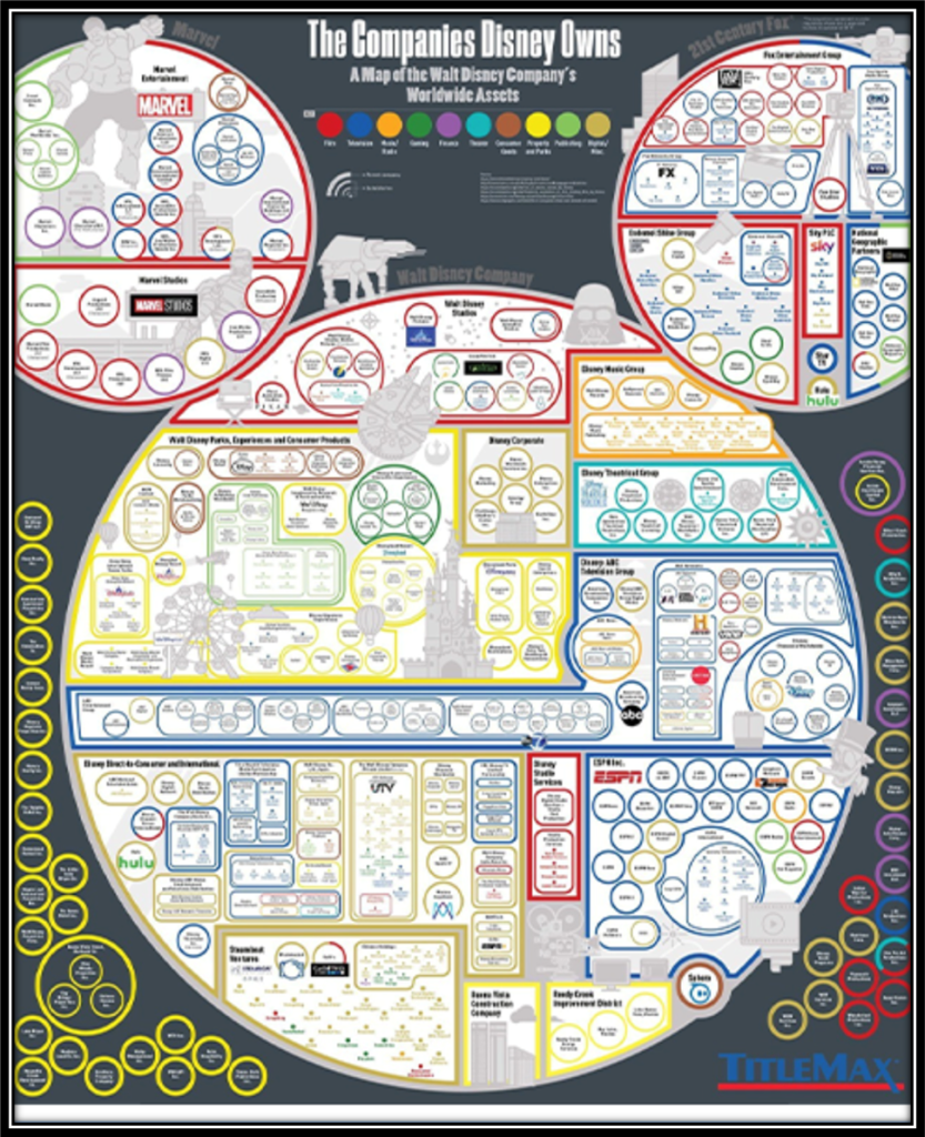
This one is the definition of bad data visualization. To start with, Walt Disney owns over $200 billion worth of worldwide assets. But, if you wanted to know about every company owned by Disney, you would have just read an infographic offered by Titlemax.
This one, however, is complicated and extensive. For starters, there’s a ton of information here. Plus, the font size, line weight, and circle sizes weren’t just right.
Disney tried to make things creative by picking up Mickey Mouse’s face as a map. But, honestly, it all went wrong.
Also, a viewer would think that the most critical assets would be in the bigger circle. But actually, the essential assets are in the smaller circles on the infographic.
Inside the three big circles are multiple different shapes, which adds to the confusion. Finally, the resolution should have been uncompromising for such a massive piece.
Long-Haul Flight Tickets Getting More Complicated
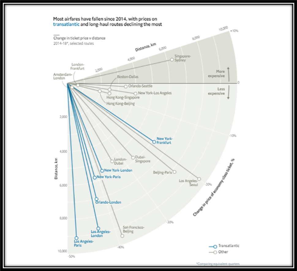
This one was published by The Economist. Let’s make it simple for you. The core idea here is the featured protractor. The infographic seems to understand the relationship between long-haul flights and ticket prices. But, the overlapping lines are something enormously confusing.
There are two featured lines. Blue-colored ones represent transatlantic flights. In contrast, ash-colored lines are all about other flights. There are a total of three axes in this visual. Each stands for Distance (in km), change in price, and economy-class tickets.
Now, the length of each line depends on the flight’s distance. But, because some lines are concise, they are difficult to trace. Moreover, the actual flight ticket prices are not even pointed out.
ASEC’s Futile Household Income Representation
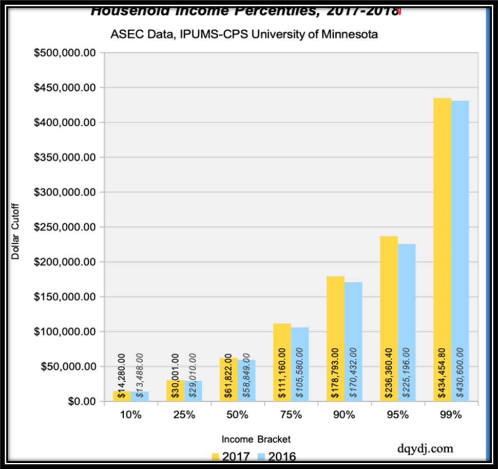
Let’s face it; this one isn’t that hurtful to the eye. But, while it was meant to be a simple double-bar graph, it went just the opposite. The charts intended to highlight the household income percentage for 2017 and 2018.
But here, the graph says it’s for 2017 and 2016. This alone makes the chart misleading. Also, because this is a double-bar graph, the percentages are depicted side by side. And, while yellow and blue aren’t that bad of a choice, it could have been better.
Another thing wrong about this is alignment. The text does not align with the bar. You would have to twist your head to comprehend the text.
Lastly, the dollar cutoff figures, stated on the y-axis, were not required.
Polluted Cities On A Polluted Graph
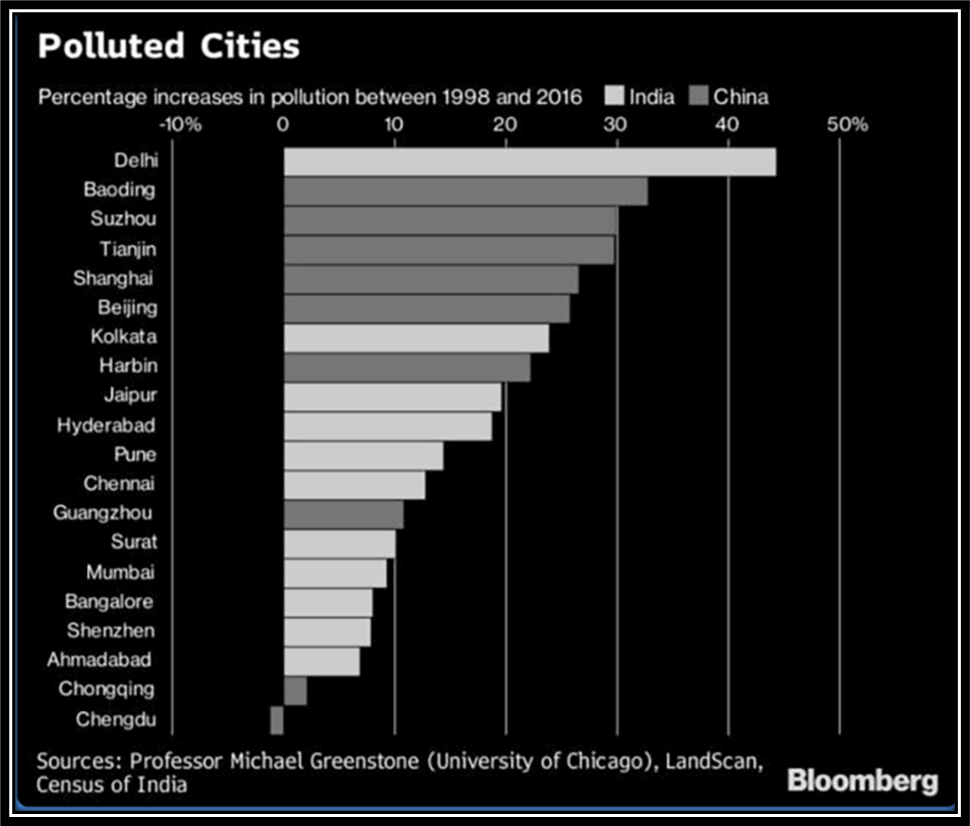
If you have ever tried to explore Bloomberg before, you’ll know that they don’t have the best of visuals. But this one is just more complicated. Apart from just mentioning polluted cities in China and India, the graph also talks about how the pollution rate has increased over the years.
The graph has taken into account the rate of pollution increase in these cities from 1998 to 2016. There are 20 cities, with 11 Indian and 10 Chinese cities. The color choices are ash and white.
So, let’s get down to how wrong this is. Firstly, the placement of labels is wrong. This is indeed because of the -%. However, this doesn’t look visually appealing. Just one city shows a positive response, while all 19 show a downfall, which is a bit abstruse.
There’s also a progressive pattern in city arrangement. In short, there are no starting or endpoints. A viewer won’t be able to understand the percentage increase or decrease. Moreover, the black theme might do justice to pollution but not the eyes. The background should have been different, with the bar graph color being white and grey.
The Takeaway
When it comes to good vs bad data visualization, a lot can go wrong if you don’t follow simple guidelines. Apart from picking the right colors, you must also ensure placement and labeling.
Moreover, you must also remember the font size, details to add, and what information to avoid. Overall, the visual should be engaging, easy to understand, and simple.
Let Us Run The Numbers for You
Basic Statistics + Comparative Analysis = Tangible Solutions
Free Trial • No Payment Details Required • Cancel Anytime